Difference between revisions of "CustomUI"
(→CustomUI Builder) |
(→Using a Custom Style) |
||
| Line 20: | Line 20: | ||
As soon as you have created a custom style using the CustomUI Builder, you should have an XML file containing the style definition. | As soon as you have created a custom style using the CustomUI Builder, you should have an XML file containing the style definition. | ||
| − | The easiest way to apply this style in your Xojo project is to | + | The easiest way to apply this style in your Xojo project is to create a constant in a Module or in the App object. Let's name this constant '''kUIStyle'''. |
=== Applying the style at Application Launch === | === Applying the style at Application Launch === | ||
Revision as of 01:02, 13 February 2015
Contents
CustomUI Builder
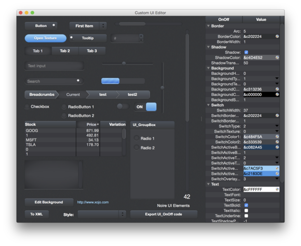
The CustomUI Xojo project includes 9 default styles.
By clicking on each element in the Window, the clicked element's style editor appears on the right. This will let you customize each element and build your own unique UI style.
To change the default style, use the Style PopupMenu at the bottom of the Window:
As soon as your custom style is ready, click the To XML button at the bottom left.
The style will be rendered in XML format and ready to be loaded in your own project.
Using a Custom Style
As soon as you have created a custom style using the CustomUI Builder, you should have an XML file containing the style definition.
The easiest way to apply this style in your Xojo project is to create a constant in a Module or in the App object. Let's name this constant kUIStyle.
Applying the style at Application Launch
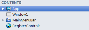
In the Xojo Navigator select the App element
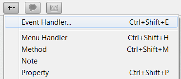
Then click on the "+" button to add a new code item, and select Event Handler
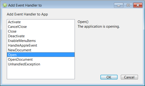
Xojo now displays the Add Event Handler window.
Select the Open event then click on OK
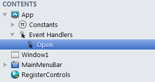
The App item now has an Open event handler in the Navigator:
Finally, copy and paste the following line of code to apply the style, assuming the XML file is named CustomStyle.xml:
Call UI_Module.LoadFromXML(CustomStyle)
Window Background
If your custom style requires a special Window background color or picture, for each Window of your Xojo project, define the Background color or Window Backdrop.
History
Version 1.6.0 - Released 2014-11-11
- New:
- UI_ListboxHeading AlignToColumns to align the Heading captions to the Listbox columns
- UI_TextField and UI_UpDown have MenuHandlers for Copy, Cut, Paste, SelectAll and Delete
- Fix:
- Fixed HeaderPressed event in UI_Listbox.
- Fixed several NilObjectException
Version 1.5.2 - Released 2014-04-17
- New:
- PictureToTexture function to quickly load a picture into a Texture style.
- Default and Cancel Properties for UI_Button
- FindDefaultCancelButton function to Push the Default or Cancel UI_Button
- Fix:
- Renamed all AntialiasedGraphics functions to prevent compilation problems
- Incompatibility with latest version of PropertyListBox
Version 1.2.0 - Released 2013-10-13
- New:
- UI_Button and UI_Popup now have a SpecialStyle property.
- UI_Slider has BackColor and HasBackColor properties
- UI_Listbox is a new class to replace the Listbox
- UI_TextField has Password and ReadOnly properties.
- Fix:
- Hidden section could magically pop out when Ribbon was resized
- Hidden tabs aren't displayed anymore when using the MouseWheel on the Ribbon
- OutOfBoundsException in RibbonTab
- UI_ScrollBar fixed a bug when Maximum = 1
Version 1.0 - Released June 15, 2013
- First release of Custom UI
